Summary: Latitude vs. X

How hot is it from the equator?! What's the weather like when we get closer to the equator? Let's find out! To accomplish this analysis, we first pulled data from the OpenWeatherMap API to assemble a dataset of over 500 cities.
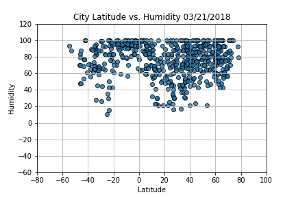
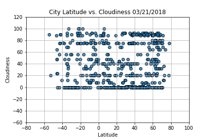
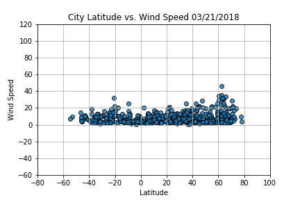
Using MatplotLib, we plot various aspects of the weather vs latitude. How do we determine what factors to use? Using the API information, we included the following factors: temperature, cloudiness, humidity, and wind speed. So what's the weather like as we change latitude? These pages will provide you with the visualizations and raw data used in the analysis along with explanations, and descriptions of trends and correlations revealed by the analysis.
Visualizations